Pages

Showing posts with label Techniques. Show all posts

Sunday, September 25, 2022

White on White Card

 White on White Card


Hello dear friends!

Can you believe that it's September already? Time flies, that's for sure.


Today's card features a technique that is not new, but it has a great look on a card.  

I have done this card in white on white.  Any color will do as long as it's the same color for the card base and the die cut that you add to the surface.


This is an A2 sized card made with white cardstock. There are no mats, and no embossing. This card is made with two layers: the card base and the design layer you glue on top. That's it.

I have a couple dies of script handwriting. The dies come from Tattered Lace. I used the large one here. Nothing is said in this die cut. It's all just random letters.

I die cut some flowers (Diamond Press) in white card and layered them. I also cut two leaves in white card.
After assembling the flower and attaching it to my card, I used a clear Sparkle pen (Crafters Companion) to color the petals on the top flowers only. I hope the picture is ok to see the sparkle. In real life, it's dazzling.

I added some gold gems to complete.
I haven't added a sentiment on the front because I didn't want to interrupt the flow of the card. The sentiment will go on the inside.


Thanks for stopping by,

Lis

Sunday, August 21, 2022

Fancy Faux Enameled Flower

 Fancy Faux Enameled Flower


Hi and welcome to my blog!  Thanks for coming!


Today's card includes a faux enamel technique using liquid embellishment drops. This was my first attempt. I have been wanting try this out.


This is a 5 x 7inches card made with white cardstock, then layered with a dark pink cardstock, then with a patterned paper from Anna Griffin.
The center die cut decoration was done with a patterned cardstock and a border die from Diamond Press.

The Technique:

For the above card I used the following embellishment drops:
  1. Scrapbook.com Pops of Color:
    • Sparkle Snowflake
    • Purple
    • Lilac
  2. Tonic Studios NUVO drops:
    • Vintage Drops in Pioneer Green and 
    • Crystal Drops in Plum Pudding
I die cut a flower from lavender pearl card.  I chose this die because it has open areas that I can color.  It's not too intricate.

I started out with the Sparkle Snowflake and filled in the petals.  Then I used Plum Pudding starting where the petals meet at the flower.  I used just a little and drew out the color with the tip. I did this for all the petals.

For the leaves I used two shades of NUVO Vintage drops.  I used the darker color at the base of each leaf going about halfway up. Then I switched to the lighter shade and completed coloring in the leaves. Then I used the bottle tip to blend where the two colors meet on each leaf.  I did not mix them.  I was careful to pull one color into the next only 1-2 times. (I think the leaves could have used a little more work but I didn't want to go over them again for fear of mixing the colors together.)
I probably could have used a toothpick or a poky tool. The bottle tip worked fine.  I made sure to clean the nozzle to avoid contaminating the color in the bottle.


So, what do you think?  Leave a comment and let me know!

Thanks for stopping by,

Lis


Sunday, September 14, 2014

Handmade Beauty - a Card


I made this card for my sister She gave me some handmade papers for my birthday last year.  The background piece on my card is one of those. I love the bold flowers in this with gold outlines on a black background.

I didn't add much to the card except some stacked paper flowers, a button and some embossed ribbon.  The ribbon I used was wrapping ribbon. Place it in our embossing folder the same as you would any paper and emboss it.  Whether the ribbon is paper or satin or what ever, it will emboss and keep the design.  It's a great way to decorate your cards.


Thanks for stopping by!
Lis

Sunday, August 10, 2014

Center Step Cards: Bonjoir France

Hi everyone!  Lis here with a new type of card that is very popular these days: it's called a center step card. (Actually there is also a side step. I hope to make some of those later.)

  What is cool about these cards is that they have a center that pops out which gives it a 3-D appearance.  I also like the sides.  It allows me to add contrasting papers which really add flair to these cards.

Here is a side view.  You can get a better idea of the construction of the card.  I used a premade/precut card and envelope set to make this card.  (Hot off the Press). I noticed that Sizzix has come out with a steel rule die for this shape as well. there is also a thin die for these that also cuts the pattern in the card stock.
It is also easy to fold and cut your own.

Here is the inside of my card.


Close up !

I found a roll of acrylic clear gems on a roll in the fabric store.  That's where I got the acrylic/black decoration from .


Hope you enjoyed this card. Come back next weekend for another one.

Lis

Sunday, August 3, 2014

Four Panel Card: French Boudoir


Today is my second four panel card.  I think I am getting addicted to these, they are so easy to make!   A you know I love all things French, so this card is full of "Frenchness"! LOL

The dies for the Eiffel Tower and the shield come from Sizzix/Tim Holtz Movers and Shapers dies. I used an embossing folder from Cuttlebug for the embossing on the shield.

I decided to make this card one color on the outside (silver) and pink shimmer in the inside. (I once saw a movie in high school that was from France and I remember all the decoration wallpaper in the apartment.)

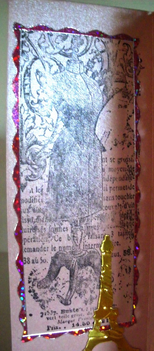
Anyway, this is the outside.  I used a Frantic Stamper precision Die (its a half panel die - Shell Half Panel Die).  I cut out the half panels in plain white card stock and sandwiched them between the silver and pink shimmer card stock.  I used Jewel Border Dazzles for both sides of my card.  Silver on the outside...

 
...gold for the inside.  You will note that the first panel is rubber stamped rather than being a die cut panel like the rest.  I got the stamp from Frantic Stamper.  It is a stamp from France (how appropriate!) La Blanche Rubber Stamps.


This is the inside of my four panel card.
 
 
Now for something really CUTE!

Do you see the little charms that I have hanging from the gold punched design?  They are Dazzle CHARMS!  These things are just the cats meow!  They are Dazzle stickers and come on a sheet. You get a pair of each design.  You lace one of the stickers on one side of a piece of plastic and the other on the other side and then you can cut them out.  OR, you can just attach the stickers to each other. Each charm already has a little hole.  They come in gold and silver and I LOVE THEM! (Remember that you can color the silver ones any color you want with alcohol ink pens.)

Pearl Silver Dazzle Charms - Hot Off the Press

Pearl Gold Dazzle Charms - Hot off the Press


I hope you enjoyed my four panel French Boudoir card.  I am sure that I will make more four panel cards so stay tuned!

Lis

Monday, July 14, 2014

Thinking of You...a three Layer Card


I got the idea for this card from a webisode called Simply Ann.  I liked the idea so much that I copied a couple of parts from it (the acetate and the window).  This card takes a little time to do but it's worth it.
I wanted to make a card for my sister who lives in New York State.  I wanted to do a travel theme because we live so far apart.
To start I decided on a 6 1/2 x 5 card base out of white cardstock. I measured some acetate and cut it with about 1/4 inch so that I could bend it back and attach to the back of my card later.  I love working with acetate.  There is so much that I can do with it like making shaker boxes, stamped designs for overlays, tinting it with alcohol inks.
I started work with my main card by covering it with paper from Graphic 45's Come Away with Me collection.  It fits perfectly with the travel theme.
I covered my card and then used the photo card die to cut the center out.  Then I glued this cut out to the inside of my card using the cut out as a guide.
I decorated each layer so that there was a surprise when you turned the page.
Layer One (the cover):
 
Layer Two:
Layer three:
 
 
Close Up!
 
Aren't these little icon people fun?
I love the flower and leaf dies! One die and several sizes of flowers and leaves! Grand!
 
I can think of so many uses for the light bulb!
 
 
One last thing I did was to take a plain white ribbon and use Distress Stain (Salty Ocean) on it.  I dyed the ribbon, dried it and it came out beautifully.
 
I hope you enjoyed my three layer card!  Thanks for stopping by! Lis


Because I used a number of dies, I thought it would be convenient to provide the links in case you wanted to look them over.
 

Friday, July 11, 2014

Handmade Beauty

Today's card uses a handmade piece of paper that was a gift from my older sister. I made two of the same card and sent one to her.  I love the large flowers and the overall mauve and blue colors outlined in gold.

I didn't want to add too much embellishments because I didn't want to cover up my handmade paper. So, I opted for a couple large paper flowers and some embossed ribbon I had lying around.


Below is a great picture of the embossed ribbon.  This is a metallic wrapping ribbon I bought.  It was nothing expensive or exotic.  In fact, this ribbon is over 15 years old!  Try embossing folders on your ribbons.  You will be surprised how well the ribbon takes embossing and how pretty the results are!  I am sure that you have a Christmas ribbons stash!

The two thin gold lines (one on either side of the ribbon) are actually washi tape.  It's new from Little B Decorative Tapes.  They are FOILED and quite beautiful.  If you buy the thin ones, you get two rolls. And that's a lot.  The one I used on my card is called Gold Grosgrain.


Have fun!
Lis
 

Saturday, June 7, 2014

Steampunk Butterfly Greetings


Hi everyone!  This was an interesting card to make.  I started off wanting a sweet Victorian card. I ended up adding a steampunk element to it.  Quite a mixture!

The unique material that I've just start using is the paper ribbon.  I've used it in pink on this card.  It starts out as paper twine (Maya Road).  I unroll it and the resulting paper ribbon is about 1 1/2 inches wide.  You get a lot on a roll too.

It does take a little patience to get it unrolled but well worth the effort. Its SO pretty.  I am working o another card and I want to ink it before I unroll it to see what tie die effects I can get. So stay tuned!

Do you like my butterfly?  I used a Frantic Stamper solid Butterfly die to cut the card base, the patterned paper mat and a gold glossy butterfly that you can just see on the inside of the card.

I stamped a gear image onto some transparency that I cut a bit larger than the butterfly window on the front of my card.  I used double sided tape to attach it to the front of my card base.  Then I added my mat (made from purple suede paper and patterned Graphic 45 paper on top).  My mat already had the butterfly window cut out.  I matched up the windows and glued it down.  The stamped transparency shows through.  I cut out a gold glossy butterfly to place on the inside of my card. When the card is closed, there is a gold background to the butterfly.

This is not a new technique but one that isn't used a whole lot.  Hope you enjoyed my card today!

Thanks foo stopping by!
Lis


Sunday, May 11, 2014

Thank You Card


I wasn't sure what to call this design. It reminds me of old Italian or Byzantine.  This is, of course, one of Tim Holtz' new Frameworks dies - called Trellis.  I really love dies that have designs tat I can play around with and change to my liking.  I can see the Frameworks dies being one of these.
 
I cut the framework out with some of the Tim Holtz paper stash I have.  I also cut it out of some dark purple and also out of grungeboard.  I used the little pieces from the purple ad the grungeboard to fill n the design in my card.
 
To prep the grungeboard, I simply added Tarnished Bronze Distress Stain to it. After it dried, I stamped some writing in StazOn Black.  If I had to do it again I would pick a stamp that had thicker lines as it's difficult to see my stamped image. One nice thing about the grungeboard is that its thicker than the surrounding paper, so it really adds a nice bit of dimension to my card.


I used glue stick to adhere everything onto a navy blue card base.  I added the blue bling last.
 
I colored my label (which was plain chipboard) and my ribbon (which was white) with Vintage Photo Distress Stain,  I also added some touches of the Tarnished Bronze to my ribbon.  It created a nice shimmer to parts of my ribbon.
 
I added a gold sentiment (Dazzles) and done.  I am thinking of changing this to a Happy Fathers Day card.  It has a nice masculine feel.


Thanks for stopping by!
 
Lis

Thursday, April 3, 2014

Mom is Love


Mom is Love - Coloring with Paper
by Lis Whiting

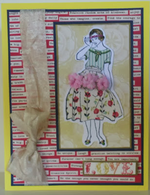
Today's card is a coloring project although it might not look like one.  I colored my stamp with papers!  This is not a new technique but one I wanted to get out of the back of the closet and dust off!
Tip: When selecting your stamp, choose one that has more outline.  This technique does not work as easily with solid stamps.
I started with a Frantic Stamper stamp of a picture of a woman with a dress that looked like the 50's to me. Frantic Stamper has a wonderful selection of Ladies for almost every time period.  I especially love the Erte group.  I stamped my image on heavy white smooth card stock in Staz-On Black. (Actually I did this several times. It gave me a couple of images to play with...you know...just in case I made a boo boo.)  I chose two patterned papers for my "coloring" and stamped the image on each of these as well.  I cut out the top part of the dress for a blouse on one and the skirt on the other. I cut out my full stamped image with about a 1/8 inch plain border around it.  I glued the blouse on with glue stick.  The skirt had a three flower design on it. I added pink carnations to that area first, then glued the skirt to my stamped image.
I chose a yellow card base and dark blue card stock for mats.  I chose a more plainivory colored paper to place my completed image on.  I finished with a crepe bow and the word LOVE attached with foam tape. I added some color to her hair with some Distress Markers. I added beige 2mm pearls to decorate.
I do hope that you give this a try. It's fun and you can use your scraps!
Thanks for stopping by!


Products used:

Saturday, March 15, 2014

Jeweled Heart Card


Today's card is really dimensional and full of whimsy (at least I think it is).  I created a very simple design by die cutting a large heart out of holographic red fireworks card and gluing decorative plastic buttons on it.  I found them at Hobby Lobby.  Usually I don't go for this kind of decoration but these were just too colorful to resist!

The matted papers are gold glitter card and a very special paper from Graphic Products Corp called
Iridescent Paper and comes from Taiwan. (Check out their Italian Florentine Papers.)

I've been a big fan of GPC for many years. They are not well known to us but they have some lovely papers, many are handmade.  If you do decide to purchase anything, be sure to check the paper size.  Many of their products are sold as "parent sheets" which are the really big sizes...on the other hand you get a whole lot for 1.70.

I hope you enjoyed today's card and browsing through GPC.  One of my goals is to bring new finds your way as I come across them. I'm always exploring and sampling, looking for new exciting materials to use in my cards.

(I wanted to let you know that I don't get anything from the companies I mention  other than Frantic Stamper as a Design Team member.  I just thought it would be nice to pass along great information to others who like the kinds of things I like.)

Thanks for stopping by!

Lis

Saturday, March 8, 2014

Leaf Embossed Thank You Card


Today's card uses nature to emboss and decorate.  The gold and silver embossed designs are from leaves that I picked up outside.  All I did was to pick out the leaves and foliage that I wanted, use Versa Mark on them, then press them onto my paper (in this case black card) and then use gold and silver embossing powder and a heat gun.  I finished with a sentiment in gold glossy and some pearls.

 
Thanks for stopping by!
Lis


Saturday, March 1, 2014

Sara Bernhardt


Sarah Bernhardt - a Coloring Project
by Lis Whiting

I saw this Frantic Stamper stamp and thought it would be a beautiful front to a card.  I stamped the image wint Staz on black onto ivory card stock. 

I used chalks to color most of the image.  I colored the stars and did the lettering with Distress Markers.  I used gold glitter Dazzles for the border and matted the entire thing onto dark brown card stock.  My card base is a dark pink. (I have to say that I briefly questioned my sanity when I chose this card base...I wasn't sure it would work out but it works beautifully with the pink chalk accents on the image's cheeks and the flowers.)


Products used:

"Art is never finished..."


"Art is never finished..." - a Coloring Project
by Lis Whiting

I've been wanting to use some transparency with my work and I thought this would be a good opportunity.  I like to work with transparency (the kind you get at Staples - nothing special).  It's a challenge working with it and getting it to combine with a card.
I stamped my images on my transparency (4 x 5 1/4 inches) in Staz-On black on the front.  It's important to use this because regular inks won't dry on this non-porous surface. 


I set the stamped piece aside and worked on the "coloring" of my background.  I am currently using Paper Artsy Fresco acrylic paints. 


I used a craft mat for this.  I chose three colors and, starting with my first color, I squeezed out a little bit onto my mat.  I used a flat paint brush and painted the top portion of my white card stock with my color.  I did the same with the next two colors, working my way down the card stock and blending the edges as I went.  I didn't want a "perfect" look so I was not too careful with my painting, allowing some white from the card stock to show through.  I edges my background in Vintage Photo.
I attached the transparency to my painted background with adhesive sheet.  Since I was not attaching my transparency with brads or staples, I needed an all over adhesive that wouldn't show.
I added a ribbon to the front of my card and used a lavender card base.
Thanks for stopping by!


Products used:

Grapes


Grapes - a Coloring Project
by Lis Whiting

I had this beautiful grapes and leaves Frantic Stamper stamp and have been holding onto it for a while. I finally decided to use it but wasn't sure how I was going to fit it on a card.  I started by stamping it with Staz-On black on plain, smooth white card stock.  I stamped another image just in case I needed it (turned out I did).
I just got the new Ranger Distress Marker colors and I've been dying to use them.  I started by coloring the leaves with Mowed Lawn and the grapes with, what else, Seedless Preserves.  I colored the centers of the leaves darker and then spritzed some water onto a paper towel and dabbed off some of the color. This is how I got the shades on my leaves.  I also used Picket Fence on the grapes (just a few lines on the center ones).  I also dabbed off some color on these as well.  I cut out the first image that was completely colored and set it aside.
I colored one leaf and most of the grapes on my second image, using the same technique.  I cut out the leaf and cut out the grapes in two sections.  I layered the leaf and the grapes onto my other image with foam tape to create a paper tole-like/3D image. I edged my leaves and the stem with gold.

To create my card, I used some pink suede paper and die cut the On the Edge Doily pattern (Tim Holtz).  I also punched out a pattern with EK Success punch.  Lastly, I used some gold foil paper to add to my card.  The layers are (from top to bottom) patterned paper, suede paper, gold foil. I attached the grapes and leaves with glue stick.


Products used:

Gold Doily on Blue


Gold Doily on Blue (A Color Challenge)
by Lis Whiting

I really love challenges!  It makes me stretch my creative "muscle" so to speak (and it's so much fun seeing what everyone has come up with - I would love to see yours! So don't forget to participate!)
This is a color challenge.  I chose some really pretty blue patterned papers and backed them with a dark solid blue.  I chose Authentique because they have collections in color choices. For yellow, I used a yellow ribbon and some gold (as a different shade of yellow).  I embossed the gold pieces - I was going for a similar design as the background blue paper. Can you tell? Isn't this tiny doily die just too cute!  And I was amazed at the intricacy of it too!  Easy to make die cuts.  I finished with a cameo and a single dark blue crystal. 


Products used: