Pages

Saturday, July 9, 2011

Scrapbook Page FRIENDS with Martha Stewart Punch

Hi everyone and welcome to the last item for the Martha Stewart Scroll Heart Punch.

Today is a scrapbook page. I don't really do much scrapbooking. I like cards best.  I hope you find this page ok.  I just didn't have a great creative day I guess.  Hope you get some good ideas from it. (The colors for this page are pink which is hard to see.  I will retake the pictures and post again later.  Sometimes I get this darker orangy color contrast and it drives me batty!)


Close Up!


Stop by next weekend for more inspiration!
Lis

Friday, July 8, 2011

Scrapbook Page with Martha Stewart Scroll Heart Deep Edger Punch!

Hi everyone and welcome to the weekend!  This weekend I am going to share some scrapbook pages with you.  Enjoy!

I used the Martha Stewart punch as a border for my picture.  I was trying to get a vintage red, white and blue feel to this. I'm not sure I did though! LOL!

I stamped a chandelier image (hero arts) randomly on the page (Basic Grey paper).  Did you recognize the suitcase? It's one of the Tim Holtz die designs from Sizzix.

I tore some DCWV papers and edged them in Faded Jeans  dye ink (Ranger) - as I did the suitcase.


Close Up!
Don't you love these alphabet pieces?  They are a dimensional yellow plastic and about the same size as typewriter keys (for those of you old enough to remember them like me!)


Here is the suitcase again. I used water droplets to make the case look more worn.


Thanks and come again tomorrow for more scrapbook pages!

Lis

Thursday, July 7, 2011

Love's Key Wedding Card with Martha Stewart's Scroll Heart Deep Edger Punch

Hello everyone and welcome to another week's experimentation with Martha Stewart's Scroll Heart Deep Edger Punch.  This week has been quite a week of discovery.  I have been working hard coming up with many designs that i hope you will use in your cards and scrapbook pages too!

Today's card:  This card turned out really pretty.  I think it makes a lovely wedding card to congratulate the new couple.  It looks like a set of gates to me and the key to open the gates of love is hanging on a pretty yellow ribbon.  (I chose the yellow ribbon because in the USA it is used to show that we do not forget a loved one when they are far from us.)


I thought about adding the hearts back in but decided not to.


Close up!

In the three images below you can see how I built my card.  The far left image is to show you what two of the punched borders (without the hearts) look like.  The middle image shows how I placed four of the borders onto my card.  The last image shows the card with a mat. (I debated about whether to put in a mat or not because the borders without the mat are just so darn PRETTY all by themselves!)


This is a close up of the borders.  I punched each border (two in yellow and two in black).  I lined up the two yellow borders as you see in the image below.  I know they look like one punched out piece but you are looking at two pieces glued to the mat.  (I used glue stick so that I could slide the punched borders around a little bit to get them to line up exactly.)

I started on the left side of my card when I started gluing down the borders.


I like ruffling ribbon tails. I like the delicate and Victorian feel that it gives a card.


I hope that you enjoyed today's card!

Join me this weekend for more Martha surprises!  I know that many of you like scrapbooking so....I will ahve a few page designs to share with you using this great punch!

Take care, Lis

Wednesday, July 6, 2011

Golden Glam Card with Martha Stewart's Scroll Heart Deep Edger Punch(Kaarten met scroll heart punch)

Hello everyone!

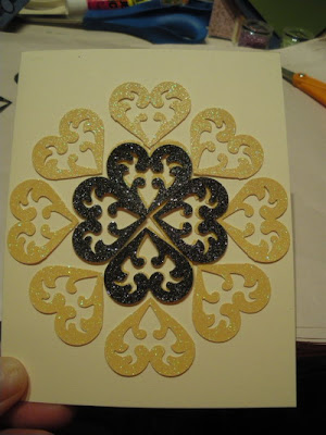
Today's card is GLAMOROUS with golds, browns and black. 

Pictures don't do this card justice.  The card base (A2) is of ivory card stock.  The mat is gold glossy.  The hearts are either yellow or black glitter card stock.  I used golden brown gems and pearls to finish my card.

You may have noticed that the center set of hearts do not have a center gem.  I didnt want to put one there because (believe it or not) I thought it would be too linear.  Then after the card was together I saw something. Read on to find out what I saw.


The center is a really good way for you to see how I placed the hearts together.  The top hearts are always pointing down so that the heart shape can be seen easily by the viewer.  I overlapped the bottoms of the hearts so that they made a diamond in the center.  I wanted to see the bottom flourish inside each heart so I made sure that the heart points didnt obscure them.

Close up!

This is a good picture of how I arranged my hearts onto my card. You can also see the placements of the gems and pearls.

When I look at the heart, I see hands placed together (thumbs up with the rest of the fingers together on each side in a line).  It reminds me of the claddaugh for some reason.  So to me, the hands are holding each jewel.

It would be really cool to make this card and put the birthstone color of the receiver in the center hearts. What do you think?

Come back tomorrow for another dazzling card using this super punch!

Lis

Tuesday, July 5, 2011

Border and Heart Card with Martha Stewart's Scroll Heart Deep Edger Punch (Kaarten met scroll heart punch)

Hi everyone!

Today I would like to share a pretty card with you!  This is a fun, easy and colorful card that you can make.  The design adds the "fancy" to my card.  The colors I chose remind me of birthday parties.

This is the way the card was originally.

This second picture is the way that my card design finally ended up.  I felt that my card needed something but I didnt want to add other embellishments because I thought it would take away from the punch design.  So, I added three lemon yellow glitter hearts. 


You can really see the hearts in this angled picture.  I think that they give this card some real interest.


Close Up!

Here you can see my added heart really well.  Since the punches are exactly the same, all I had to do was glue one on top of the other.


I put one heart right under the bow.  I thought this really looked cute.  It says "I love you."


I hope you enjoyed today's card. Please remember to look at the past few posts for more ideas on how to use this wonderful punch.  Also come back during the week as I will be posting two more cards for you!

Take care, Lis

Monday, July 4, 2011

HALLOWEEN Designs??? with Martha Stewart's Scroll Heart Deep Edger Punch


Hello everyone!

Yes, you read it correctly...Halloween designs!  Take a look!

I started out with halloweeny colors: orange card stock, lemon and black glitter card stock.  I punched the scroll heart border and cut off the hearts. (Save them for later!  Did you see my post with heart designs?) 

This first picture is of the border without the hearts.  It looks very pretty.  Doesn't it look like lemon glitter pumpkins?  It reminds me of Cinderella's carriage.  The Halloween colors add to the halloween feel.


I added the same border in black glitter.  I slid the top border so that the lemon yellow glitter would just show underneath.  Do you see what I see?  BATS! PUMPKINS! SPIDERS!  Oh my!

Bats: Look inside the "pumpkin".  You should be able to see an orange bat.  The yellow and black glitter card stock outline the bat. 
Spiders: Look between the pumpkins.  The spider has two legs and is looking at you!


I like this border and decided to see what it looked like with two of them.  (The spiders look more like masks now.)


I added back the hearts in black glitter.  This would be good for a themed card like "black heart" or something.  Gold hearts would look good too.


I punched a complete border at the top of my orange card stock and added the black glitter card stock back in.  It looks ok but I think that the orange border takes away from the black glitter design. What do you think?


I hope you enjoyed my early Halloween designs.  I bet you never thought you could use the Scroll Heart Border punch for Halloween!

Come back soon...I have cards next!

Lis

Scroll Heart Designs with Martha Stewart's Scroll Heart Deep Edger Punch(Kaarten met scroll heart punch)

Hi everyone!  Happy Independence Day to everyone!  Be safe out there!

Today I would like to share some designs with the heart portion of the scroll heart! 

To get my pieces, I chose my paper, punched the border and then cut out the hearts.  This is actually very easy to do with a small pair of sharp scissors.  The papers I am working with are from the DCWV line.  I am using lemon glitter and black glitter card stock.  Martha's punch works well with these glittered papers even though its an intricate pattern!

I started out with four hearts together and then added a couple.  Pretty!  I can imagine this as a center piece of a card.

I added some more hearts and this is what I ended up with.  Another really pretty center that would look great on a square card.

 I decided to change the color of some of the hearts and this is what I got.  Very pretty.


 I decided to see what other designs I could get and started with this line of upside down hearts.

I decided to add some more hearts and alternate them.


I thought this angled pattern looked good.


I added these lemon hearts to see what it would look like if I didnt follow the pattern.  There are possibilities here!


I am a fan of Lace (pronounced lay-SAY).  This is a European technique of cutting and weaving paper together.  I thought "well, let's try it with these hearts".


I thought the other was ok but I wanted to change it up so I ended up with this.


Because I am so geometrically oriented, I wanted to fill my page with hearts...so I did.

 I liked the diamond that was created by putting two hearts together so I put all my hearts that way.

Whew!  There are SO MANY possibilities just for the hearts that I could fill up pages with designs.  I hope that you take out your punch and start playing with the designs!  You never know what you will get!

Come back later for more inspiration!

Lis