Pages

Saturday, June 18, 2011

Wish Collage Card

I really love collage.  I am taking a course online from Claudine Hellmuth on Composition so that I can have a better understanding of why some of my cards look "right" and others don't.  It's been enlightening.  During June I am sharingthe cards and compositions that I make during my class. Today's card is an Asymetrical Collage.

The card is called "Wish".


I like the way this card came out for several reasons.  I like the pink accent gems on the card.  You may not be able to see it but there is a very light pink swirl design in the background paper that I used and the gems pick it up.  The gems and the pink of the background relate back to the dark pink ribbon I used at the bottom.

The tag and sign post are made from kraft paper, I added some victorian violet and old paper dye inks to them.

Close Up!


I punched out a border design: one in paper and one in gold glossy.  I offset them so the gold shows through a little.  I think this gives them just enough gold accent. The paper I used to punch my border is from a black and white flower pattern.  It really worked out well because the pieces of flower pattern that show seem to look like "rays" which fits really well with the gold accents behind.


I hope you enjoyed today's card!

Lis

Friday, June 17, 2011

Pen Nib Butterfly Collage Card

I have been wanting to take some art classes so that I could learn a little more technique, rather than just winging it.  I found this great online class for Composition by Claudia Hellmuth who is a well known collage artist.  The class has been really fun AND very informative.  I am learning alot.

Anyway, each week I do one project to practice the new topic studied and then I do a card with it.  The following is my card.  The topic we studied the 2nd week in June was the horizon line.  I thought I would share my cards with you as I learn about composition!


Close Up!

I love how my butterfly turned out!  I added a pen nib for the body and added a few gems and a pearl.  Do you see the little brown butterfly on the wing of the bigger one?


Of course if I have something flying on my card, I need to have some swirls of bling! It kind of looks like the pen nib is writing in crystals too.


I used one of the new texture trades of Tim Holtz to emboss my "Post" flower. (The other one was embossed with one from the same set.)


I hope you enjoyed this card.  I look forward to sharing another one from my class!

Take care, Lis

Wednesday, June 15, 2011

Vine with Flowers Card

Hi everyone!

Well Summer is here!  The temperatures are hot and the skies are blue (and my Air Conditioning is running! LOL). 

Today's card is a simple card I made using a vine felt border and paper flowers.  The felt makes this card very tactile.


I added clear rhinestones to the flower centers and a couple of bendable wire leaves to the flower clusters.


Close Up!

Thanks for stopping by!
Lis

Monday, June 13, 2011

Raw Steam

Hi everyone and welcome to my final steam punk inspired card. I call it "Raw Steam".

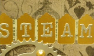
I use a black card base with a gold mat.  The paper is from DCWV.  The gears and letters are from silver glossy card stock and are decorated with brown pearls.

To make the title:
  1. I put down a line of tissue tape (Tim Holtz).
  2. I punched out five small tag spaces (Martha Stewart).
  3. I added the letters in silver glossy (Tim Holtz Typeset alphabet).
I was really pleased with how good the silver letters were against the gold background.  The silver gloosy card stock gives my card a real "steel" feel to it (sorry about the rhyming...I didn't do it on purpose! LOL)

I really love the Typeset alphabet.  The letters are not straight lined and have some real character to them.


I attached the gears to my card with mounting tape. Each gear is at a different level.  The mounting tape allows me to build up 1, 2, or three thicknesses so that I can overlap the gears. This makes it nicely three dimensional.

Close Up!

Although I used the word "steam" on my card, you could also use any other word.  You don't necessarily have to find a five-letter word either.  JOY, even LOVE (leave the center spot blank or put a heart there) would work.


 Being in a pearl phase (LOL), I added some pretty brown pearls to my gears!

I hope that you have enjoyed my steam punk inspired work this weekend.  I have enjoyed sharing it with you.  My hope is that you will be inspired to create something beautiful that you can share too!

Take care and see you next weekend!

Lis

Sunday, June 12, 2011

Flower Punk

Hi everyone!  Today's steam punk inspired card is using gears and clear gems to create a "flower" card.

I could have gone the traditional route and put some gears on top of stems and leaves.  I wanted to come up with something a little different.

The card below is made with an ivory card base, gold and purple mats and a yellow patterned paper.  The gears are purple (going back to the mat), a pretty salmon color, green, pink and gold.

The gears are decorated with clear gems and everything is tied together with a green ribbon.

One thing I didn't do was add gems all the way around each gear.  I think that by adding the gems to a portion of the gear (and not the same portion on each gear) that I was able to get some look of motion to the card.  What do you think?


The layout for this card goes to Bobbie, my good friend.  She and I were visiting in northern California a couple of weeks ago.  We were making this card and her design was really great so we decided to use it!

I added the four leaf clover as something fun for this card.  Also did you notice the string linking one gear to the next?  Look at the two gears with center gems.  I think I should have used something a little thicker and darker so that it would stand out, but the idea was a good one.

Close Up!

Come back tomorrow for my final card (and my favorite)!

Lis