Pages

Saturday, May 31, 2014

Father's Day Scrapbook Page


Today's project is a 12 x 12 inch scrapbook page for Father's Day. I used the papers and labels from STRONG which is from Authentique (a favorite line of mine). The colors for Strong are browns, terra cottas and denim blues. These colors will go with everything!

I started out by using two of the frames that are in this collection.  What you see on my page are actually two frames.  I thought they looked so good together that I didn't separate them. (I love all things newsprint.)

I added tabs to the word labels (which I cut from one of the papers) with my Tiny Attacher.  I figured staples are manly too, yes?

One thing I like is that if I don't like one side of a tag or label, I can turn it over and use the other side. One side has writing and the other side has a different pattern on it and is blank. That is so cool!

Isn't this cute?


I created my journaling "book" by using the tabs from the collection and adding heart shaped eyelets.


This is the journaling space opened. It gives a little 3-D piece to this page.


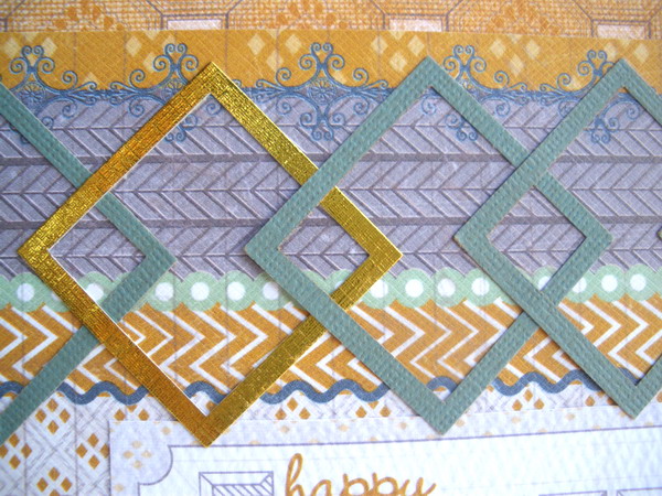
Last but not least I wanted to mention the border design I made. I used two different sized square punches. I punched the small punch first. Then I punched the larger square around it to get the square frames below. To make sure that I was positioning the punch correctly I turned it upside down. I laid each square frame down to see how many I would need. Once I got the position the way I wanted it, I glued each one down.


I hope that you enjoyed today's scrapbook page.  Stop by again soon!


Monday, May 26, 2014

Miss You - A Memorial Day Card


As we celebrate Memorial Day, we stop to remember those we have lost.  Normally we make thank you cards. Today I made a Miss you card.  I was going through MSN online and there was an article on all the surprise homecomings for troops back from Afghanistan and other countries over there.  I thought to myself  that not only are the men and women soldiers making a sacrifice but so are their families.  That can't be easy.  It has to be so hard when a child loses a parent, when a parent loses a child in war.
 
So, Thank You to all of you who have protected my freedom.  And I will miss all of you - and remember your sacrifice- who never came home.
 
Lis

Saturday, May 24, 2014

Happy Father's Day Card


Don't you just love it when the stars align and everything comes together to make a beautiful card?  This was that card for me last night.  I wish that all of my cards would come together so easily but sometimes I really struggle. 
 
Today's card is a pretty one using Prima flowers in burlap, some unusually colored leaves, some lace and a homemade banner at the top.  I even used some washi tape accents at the top and bottom.  I also put inside my card.


Don't you just love the leaf colors? I decided to start using different colors.  I saw that Prima had some different ones and I thought they were just so cool!  They really go well with my flower which a little on the drab side.

I love how my label turned out.  I used the same paper (K and Company) as I did for the mat on the card base.  I matted it on white and cut some white for the center and then stamped in black.  Do you like this tiny saying?  I found a set of Tiny Sayings stamps at Hot Off the Press (Paper wishes.com). I'm always looking for a great set of sayings stamps with interesting fonts and styles that I can use on small tags.


I added some lace that I've had lying around for a while (I won't admit how long!).  Take another look at my tag.   added one piece to it also.

Hope you enjoy this card and make some beauties of your own!

Lis

PS: I bet you may wonder why I've not made any Mother's Day cards.  My mom passed away a few years ago. It's still so hard to get by during any holiday.  I don't have any family of my own and I'm not married so its double hard.  I miss her. We didn't always get along or agree on everything but she was there for me.  She taught me the value of education.  She got a nursing degree and a four year degree in her 50's.  I carry a picture of her and me when I graduated college that I look at once in a while.  She was an amazing person.

Saturday, May 17, 2014

Flowers for Dad - A Father's Day Card


Today's card is a Father's Day card that I made for my dad. He's 96 years old! Wow!  He still cooks and cleans and does his daily thing.  He's amazing!  He is also a World War II veteran.  He fought in Italy and Africa.

So, my card today is for my dad.  I wanted something cheery so I picked this vibrant turquoise blue cardstock.  I chose some shiny gold foil card which I embossed and die cut with an embossing folder with die cut parts to it (those are the little cut outs at the top and bottom).  These are really nifty folders and so pretty too!  I've only seen 2 I think so I don't know if anyone made any more.


I added a couple of flowers to the center with a jewel center.  Thanks for stopping by.  Make sure to come back next week for another Father's Day card.


Lis

Monday, May 12, 2014

Jeweled Butterfly

Hi everyone!  I have a surprise post for you today.  Normally I post on the weekend but I made a butterfly card last night and really wanted to share it!

I love butterflies.  They are so delicate and add whimsy and dimension to any project.  I used the latest Frantic Stamper butterfly dies to make this card.  I love that they made a solid one to match the cut out butterflies.  I always mat my butterflies so that I can stretch their wings!

This card uses only the solid butterfly die.  More room to decorate!


I had this really great butterfly paper that I rediscovered in one of my 6x6 pads while I was cleaning up my small but crowded work space...LOL.
 
I used Robins Nest Dew Drops in the dark blue rounds and some diamond shapes.  I also added some lavender and white pearl Liquid Pearls to the wings.

 
Here is a side view.


Thanks for stopping by!
Lis

Sunday, May 11, 2014

Thank You Card


I wasn't sure what to call this design. It reminds me of old Italian or Byzantine.  This is, of course, one of Tim Holtz' new Frameworks dies - called Trellis.  I really love dies that have designs tat I can play around with and change to my liking.  I can see the Frameworks dies being one of these.
 
I cut the framework out with some of the Tim Holtz paper stash I have.  I also cut it out of some dark purple and also out of grungeboard.  I used the little pieces from the purple ad the grungeboard to fill n the design in my card.
 
To prep the grungeboard, I simply added Tarnished Bronze Distress Stain to it. After it dried, I stamped some writing in StazOn Black.  If I had to do it again I would pick a stamp that had thicker lines as it's difficult to see my stamped image. One nice thing about the grungeboard is that its thicker than the surrounding paper, so it really adds a nice bit of dimension to my card.


I used glue stick to adhere everything onto a navy blue card base.  I added the blue bling last.
 
I colored my label (which was plain chipboard) and my ribbon (which was white) with Vintage Photo Distress Stain,  I also added some touches of the Tarnished Bronze to my ribbon.  It created a nice shimmer to parts of my ribbon.
 
I added a gold sentiment (Dazzles) and done.  I am thinking of changing this to a Happy Fathers Day card.  It has a nice masculine feel.


Thanks for stopping by!
 
Lis

Saturday, May 10, 2014

Celebrate!


I'm always looking for a way to make a birthday card a little different-looking.  With Valentine's Day in February and my dad's birthday on the 25th (he's 96 this year-wow!) I thought I'd try to do something in red and gold.

I decided on an ivory card base with a heart border.  I knew I wanted some gold matting and added some pink patterned paper (Bo Bunny) and some plain red also.  I used several Frantic stamper dies to decorate and the Perfect Layers rulers to make my mats quickly and ...well, perfectly ( no lie, these are great).

I'm a blingy kind of person and I used red glitter card.  I wanted a really nice flower so I layered green suede paper for the stem.  I really love crepe ribbon with its wrinkly texture.  I use it on a lot of my projects and I did here. I wanted to add something to fill up the right side of my card and thought it would be fun to have a set of goblets - to toast his birthday.

Now, guess what he material is that I used for a background mat - you know that bright gold, wrinkly paper?  It's crepe paper!  Yup!  Just like the kind we used as kids - except this kind is has a metal coating on it to give it that gold look.  I found this special crepe paper (and tons of colors as well as Desden Foil or German scrap) at Castle In The Air.  I like it so much that Ive added it to my favorites!

Thanks for stopping by!


Products used:

Thursday, May 8, 2014

Wine Country Bracelet


I've had the Frantic Stamper Bottle die for a while and have been thinking of creating a piece of jewelry.  I like shrink plastic and have been experimenting lately with it again.  Each new die I use with shrink plastic does have it's own challenge.  This time I have learned that not all die cuts are created equal and each one has to be heated carefully if I want the finished product to come out right.
 
The bottle was easy to cut out of shrink plastic and heat shrink it.  To start I sanded the piece of shrink plastic so that it would hold color from chalk.  I then colored four sections, each representing a different kind of wine.  Then I cut out each bottle.  When I was heating each piece separately, I held my heat gun about 3-4 inches above my die cut so that the heat would go to the piece evenly.  I held my piece with some scissors (I really need to get a better tool for this!) As each piece shrinks, the color darkens.

I added some rub ons to decorate my bottles. Then I just added them to a chain for a bracelet.  I coiled some gold tone wire around the neck which does look pretty.
Notice that I used white rub ons for the purple bottle. I thought the color was too dark for black rub ons. I think this worked out perfectly.

I hope that you try this out with some of your dies!


Sunday, May 4, 2014

La Mode - an Arty Tag


Today I received a box from Fran!  And in that box was a set of new paints by Paper Artsy called Fresco Paints.  I had seen these on the site and really wanted them.  I think the word "fresco" drew me in...LOL.  
So, how to try out my new paints? I decided to make a tag with a paint background.  I chose some of the colors - some blues and a pretty cream color, got out my cosmetic wedges and pulled out some card stock.  I made my own tag (6 x 3 1/2 inches) this time because I wanted a larger size to work with.
I chose a few Frantic Stamper stamps to work with including a tag stamp.  Before I started painting I stamped my tag stamp onto some paper and made a mask and placed that on the bigger tag.
This paint is so nice!  It's creamy and covers really well.  The colors mix well also. I was able to blend while wet easily.
After I got my color background done, I stamped the shoe stamp randomly onto my tag.  I used the new Tim Holtz colors in Distress Markers to color my stamped shoe images.  I wasn't sure if this would work but it worked really well. The distress markers were transparent but you could easily see the colors over top of the paint which was very cool.  As my final step, I used the Pearl Glaze from the Fresco paints and applied a thin layer over my entire tag.  It was gorgeous!  The paint went on very smoothly and dried quickly. It left a really nice pearly shimmer.
To complete my tag: I removed the mask from the tag.  I cut some washi papers and added them onto my card with glue stick.  I had an old post card which I added to the bottom of my tag and then trimmed off.  I added some crochet ribbon to cover the seam.  I stamped La Mode (also Frantic Stamper) at the bottom on the post card.  I added Viva Decor Pearl Pen pearls to the smaller tag.  I added two colors of ribbon to the larger tag and fastened them with a small brad.
That was fun! 


Saturday, May 3, 2014

Victorian Birds and Cage


Hi everyone!  I was working on card ideas today and thought I would make a birthday card using some new papers that I got from Graphic 45.  Their papers are so nice, such a Victorian feel.  I decided on lavender as the main color because that seems to emulate the Victorian era to me.  I found this really great lavender stripe paper that reminded me of wallpaper.  I had some purple suede paper and used that as the mat, and used an ivory card base.
 
I have this Martha Stewart punch that is extra large. It's a challenge using this one on my cards because I usually only work in A2 size.  Today I decided I just had to use it!  I cut my card so that it would fit the punch design and punched the side of the card. It came out ok but I decided a second layer of the punch in lavender would be a good idea. 
I also use gold as a secondary color.  (I even used some gold bling!)  I cut out the Frantic Stamper birdcage die and a couple of birds too.  You may not have noticed but the flying bird is actually the negative cut into the lavender pattern paper. It's not layered on top.  The burgundy bird sitting on the cage is a separate piece of paper. I did this to create some dimension.
 
I wanted to have an open bird cage door.  I did it by using one of the die cut pieces, using mounting foam and reattaching it.  It looks very cool! You cn see in the picture below how I engineered it.
 
I left a place on the card for a Happy Birthday Sentiment which I haven't added yet.
Thanks for stopping by!