Pages

Thursday, June 30, 2011

Geometric Designs - Circular Logic Card

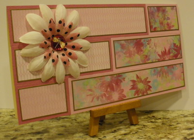
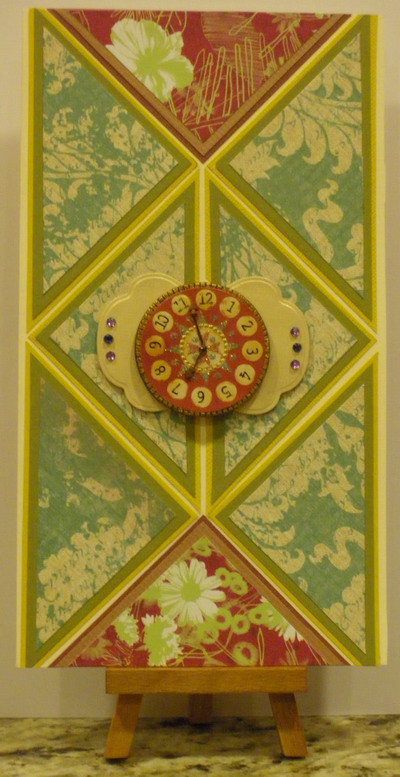
Hi everyone and welcome to the 4th and final installment of my Geometric Designs for Cards!

Today I want to share something a little less "exact"...circles!  Yes, of course circles can be placed on a card in a very exact way but I decided with this card I would do a more random pattern.


I outlined the base card (ivory card stock) with some 7 Gypsies paper tape in Lille. I chose the canceled stamps - they are so colorful! Then I used some of the new Basic Grey paper in Oxford as the center.  I love this beautiful blue.  Then I added circles...different sizes, colors and even a couple with scallops.  I admit that I cheated a little. When I got the Basic Grey 12x12 paper pack, they had a sticker sheet that included many circles. These are the ones I used.  However, you can also use punches or dies to cut out your circles.  I do think that circle frames work out much better than solid circles.


Close Up!


Thanks for stopping by!

Lis

Martha Stewart's Scroll Heart Deep Edger Punch - Another Weekend with Martha!

Hi everyone!

I continue to get hits on the pages I did with the Martha Stewart Scroll Heart Deep Edger Punch. 


So many of you like that punch and I dont blame you! It's beautiful!  So, I have decided to create some more beautiful designs using this punch this coming weekend.  (In case you missed the original projects, look in my blog starting February 19th.)


Stay tuned!

Lis

Tuesday, June 28, 2011

Geometric Designs - Rectangles and a Summer Flower

Hi everyone and Happy Tuesday!

Today' I want to share with you another card with a pretty geometrical design. 

I love the way that geometric designs are so neat and balanced.  I used to do a lot of geometric art when I was in high school and I still love it today.

I started out with a single color palette of pinks and reds (mostly).  I chose two patterned papers and cut strips 6 1/2", 4 1/4" and 2".  I outlined them in gold then matted them.


I lined up three strips on one end and then was able to easily line up the other strips using the first strips as a guide.  For this type of pattern, it is important to be exact as any difference will cause the strips to not line up exactly. 

I added some petaloo flowers to accent my card and I was done! Very pretty!


Close Up!

I really love the glass embellishment with the dragonfly image inside.  It's just perfect for this summery card.

Here you can see the layers BUT did you know I only used two?  The faux layer is actually where i edged the patterned paper in gold. 


Hope you enjoyed today's card!

Lis

Monday, June 27, 2011

Geometric Designs - Triangles and Time

Hi everyone!

Hope that you are all doing well this last week in June.  I know that I normally post every Friday through Sunday but this past weekend was a busy one and I worked.  So, I am posting this week!

I love geometric designs.  Today's card is done with triangles! 

I really like the design.  I started out with 2 1/2" squares which I then cut from corner to corner to make my traingles. Then I glued each triangle to my next cardstock and then cut the mat.  Then I glued this to another cardstock and cut another mat. I arranged the triangles on my card.  I cut my card edge down to size once the triangles were in place.


Close Up!

The clock sticker that I used is really 3-dimentional!  It is fromt he Joliees Sticker Line called Parcel.  This line is full of wonderful old-timey, victorian-feel stickers of all sorts, even crocheted flowers!  They are really beautiful to add to any card.

I added a label (Spellbinders) and a few gems (and the clock) to my card...although the design can stand on it's own.


 I matted each triangle twice with two different sized edges.  How did I manage to do that EASILY?  I'll tell you.  There is a product out there called Perfect Layers. It is a set of clear plast "rulers".  The rules have an edge to them (there are four different ones to each ruler).  You but the ruler against the first paper and cut and you have a perfect mat each time.  I LOVE this product!  All you need is an x-acto blade (or one of those round blades that you use to cut fabric) to cut the mats.  No measuring!

Here is a blogspot with a short tutorial: Click HERE. (This is from 2007 but is a good pic by pic.  She talks about 2 rulers which is from the old set.  There are now three rulers and another corner thingie.)

You can find Perfect Layers sold at HSN. Click HERE to see that page. (They also have a video tutorial that you can see.)  If HSN is sold out you can try ebay.

I highly recommend this product. You will love it if you get it!


Hope you enjoyed today's geometric card!  Stop by tomorrow to see another one!

Lis

Sunday, June 26, 2011

Compostion for Design - Grid: Music 9 Times

Hi everyone,

I wanted to share my last composition from my class. It is called a grid design, and I am sure that you recognize it.  This is a popular and easy composition design to use.  Enjoy!

Lis


Close Up!

Saturday, June 25, 2011

Geometric Designs for Cards

Hi everyone!  Happy Saturday!  I hope that you are enjoying your day and doing something crafty!

This week I am going to publish some geometric designs for cards.  I love geometric designs (but not geometry!) because they are clean, usually simple to do and they can have a powerful effect without much effort.

I call my first card "Intersection Flower." (Unfortunately I was not very creative so if you can think of a better name, let me know!)

This is a very simple design on a 5 1/2 inch by 5 1/2 inch ivory card.  I used the same color dark purple card stock to mat all of my pieces (only three!).


There really isn't too much to this card.  I really like the look of the big flower.  I used a green background to hint at green grass and leaves.  Is that what you thought of when you looked at it?

I like geometric designs also because I feel free to use a lot of patterned paper without guilt(LOL)!


Close Up!
I used four little pink jeweled brads as decoration. They didn't attach the paper to anything. I used glue stick for that.

Hope you enjoyed today's card. Come by again!
Lis

Vignette Composition

Hi everyone!  I wanted to share my vignette composition that I learned about in my class with you.


I can really see using this on a card!

Lis

Monday, June 20, 2011

Thank you for Your Comments!

I sincerely appreciate ALL of your comments!  I read each one.  I never delete any of them (so I can refer back to the feedback I got on my work).

I know that sometimes its difficult to leave comments on the Blogger system.  There is one site where I have to click several times before the page takes my comment. How frustrating!

And remember that you can EMAIL ME any time you want to. I have a link at the top left of my page that you can either click on or copy.  I will answer your emails too!

If you don't like leaving a comment or emailing me, you can use my Voting Buttons at the end of each Post. (See below where it says "Quick Feedback?") You can click on one and vote Not for me, Ok, Love it!

Thanks again!

Lis


Saturday, June 18, 2011

Wish Collage Card

I really love collage.  I am taking a course online from Claudine Hellmuth on Composition so that I can have a better understanding of why some of my cards look "right" and others don't.  It's been enlightening.  During June I am sharingthe cards and compositions that I make during my class. Today's card is an Asymetrical Collage.

The card is called "Wish".


I like the way this card came out for several reasons.  I like the pink accent gems on the card.  You may not be able to see it but there is a very light pink swirl design in the background paper that I used and the gems pick it up.  The gems and the pink of the background relate back to the dark pink ribbon I used at the bottom.

The tag and sign post are made from kraft paper, I added some victorian violet and old paper dye inks to them.

Close Up!


I punched out a border design: one in paper and one in gold glossy.  I offset them so the gold shows through a little.  I think this gives them just enough gold accent. The paper I used to punch my border is from a black and white flower pattern.  It really worked out well because the pieces of flower pattern that show seem to look like "rays" which fits really well with the gold accents behind.


I hope you enjoyed today's card!

Lis

Friday, June 17, 2011

Pen Nib Butterfly Collage Card

I have been wanting to take some art classes so that I could learn a little more technique, rather than just winging it.  I found this great online class for Composition by Claudia Hellmuth who is a well known collage artist.  The class has been really fun AND very informative.  I am learning alot.

Anyway, each week I do one project to practice the new topic studied and then I do a card with it.  The following is my card.  The topic we studied the 2nd week in June was the horizon line.  I thought I would share my cards with you as I learn about composition!


Close Up!

I love how my butterfly turned out!  I added a pen nib for the body and added a few gems and a pearl.  Do you see the little brown butterfly on the wing of the bigger one?


Of course if I have something flying on my card, I need to have some swirls of bling! It kind of looks like the pen nib is writing in crystals too.


I used one of the new texture trades of Tim Holtz to emboss my "Post" flower. (The other one was embossed with one from the same set.)


I hope you enjoyed this card.  I look forward to sharing another one from my class!

Take care, Lis

Wednesday, June 15, 2011

Vine with Flowers Card

Hi everyone!

Well Summer is here!  The temperatures are hot and the skies are blue (and my Air Conditioning is running! LOL). 

Today's card is a simple card I made using a vine felt border and paper flowers.  The felt makes this card very tactile.


I added clear rhinestones to the flower centers and a couple of bendable wire leaves to the flower clusters.


Close Up!

Thanks for stopping by!
Lis

Monday, June 13, 2011

Raw Steam

Hi everyone and welcome to my final steam punk inspired card. I call it "Raw Steam".

I use a black card base with a gold mat.  The paper is from DCWV.  The gears and letters are from silver glossy card stock and are decorated with brown pearls.

To make the title:
  1. I put down a line of tissue tape (Tim Holtz).
  2. I punched out five small tag spaces (Martha Stewart).
  3. I added the letters in silver glossy (Tim Holtz Typeset alphabet).
I was really pleased with how good the silver letters were against the gold background.  The silver gloosy card stock gives my card a real "steel" feel to it (sorry about the rhyming...I didn't do it on purpose! LOL)

I really love the Typeset alphabet.  The letters are not straight lined and have some real character to them.


I attached the gears to my card with mounting tape. Each gear is at a different level.  The mounting tape allows me to build up 1, 2, or three thicknesses so that I can overlap the gears. This makes it nicely three dimensional.

Close Up!

Although I used the word "steam" on my card, you could also use any other word.  You don't necessarily have to find a five-letter word either.  JOY, even LOVE (leave the center spot blank or put a heart there) would work.


 Being in a pearl phase (LOL), I added some pretty brown pearls to my gears!

I hope that you have enjoyed my steam punk inspired work this weekend.  I have enjoyed sharing it with you.  My hope is that you will be inspired to create something beautiful that you can share too!

Take care and see you next weekend!

Lis

Sunday, June 12, 2011

Flower Punk

Hi everyone!  Today's steam punk inspired card is using gears and clear gems to create a "flower" card.

I could have gone the traditional route and put some gears on top of stems and leaves.  I wanted to come up with something a little different.

The card below is made with an ivory card base, gold and purple mats and a yellow patterned paper.  The gears are purple (going back to the mat), a pretty salmon color, green, pink and gold.

The gears are decorated with clear gems and everything is tied together with a green ribbon.

One thing I didn't do was add gems all the way around each gear.  I think that by adding the gems to a portion of the gear (and not the same portion on each gear) that I was able to get some look of motion to the card.  What do you think?


The layout for this card goes to Bobbie, my good friend.  She and I were visiting in northern California a couple of weeks ago.  We were making this card and her design was really great so we decided to use it!

I added the four leaf clover as something fun for this card.  Also did you notice the string linking one gear to the next?  Look at the two gears with center gems.  I think I should have used something a little thicker and darker so that it would stand out, but the idea was a good one.

Close Up!

Come back tomorrow for my final card (and my favorite)!

Lis

Saturday, June 11, 2011

Mardi Gras Punk

Hi everyone and welcome to my weekend of steam punk inspired cards.  Today I would like to share a Mardi Gras Punk card with you!

I think that gears can be a fabulous addition to a card.  In today's card I used different colored card stock for my gears. 

My golden mask and trident were cut from The Slice Spook Alley.  I embossed the mask with an embossing folder and added some bling to it.  The large gear behind it looks a little like part of a crown.


Since Mardi Gras is all about having fun, I added a couple of punch charms to this card. See the crown in metallic pink and the four leaf clover in ivory/black?

I did include one silver and one gold gear to my card.  I thought the mix of metals and matte color worked well.


Close Up!

See you tomorrow for my next card!

Lis

Friday, June 10, 2011

Create with Gears Card

A very quick and simple card.  I used a background paper and a simple tag onto which I double stamped a chandelier.  I added gems and pearls and the word"create."


 Close Up!

Think about adding a message to a simple tag.  Hello, love, whatever!
Stay tuned for more gears cards!

Lis

Golden Gears Card

Welcome to a weekend of gears and steam punk! 

I was visiting a friend of mine in northern California and she asked me what steam punk was.  I told her that I thought it was a combination of Victorian and industrial imagery.  I'm not sure if that is the correct definition but that's kind of how I think about it.

I am crazy for gears!  Watch gears, clock gears, industrial gears...I can't seem to get enough.  Spellbinders has a set of gear dies that I have used in all of the cards I'm going to share with you this weekend.

My card for today (there are four total this weekend): Golden Gears

I used a really pretty paper from DCWV and added ribbons and gems to it.  Then I added the gears on top.  I used mounting tape so that I could add 1, 2, or 3 thicknesses so that the gears would lay over top one another.

I like the way the openness in the gears allows you to see what's behind it. (Hmmm, I wonder what cellophane would look like.  I may have to try that out too.)


I think I must be in a pearl phase.  I seem to be adding pearls to everything I make lately.  So, pearls with gears? Why not!

Close Up!

I think that adding pearls (or rhinestones!) make the card more feminine overall.

Come back tomorrow for Mardi Gras Punk~!

Lis

Thursday, June 9, 2011

Steam Punk

Hi everyone!

This week I'm all geared up to create some interesting and surprising cards using gear die cuts and gear motifs.  I think you'll be surprised as how pretty some of them are.
So, starting tomorrow, stop on by and see what gears and steam punk can be in a card!

See ya,

Lis

Wednesday, June 8, 2011

Wish Card

Happy Wednesday!

I have a lovely card that I want share with you today called "Wish".

I used one of the new Kraft Glassine sheets that Ranger has put out.  Its pretty different as a medium to work with.  It doesn't take double stick tape at all well.  I am using tacky glue to adhere it to the card. 

  1. I embossed the sheet
  2. I rubbed Vintage Photo dye ink over the embossed parts to bring them out.
  3. I sprinkled drops of water on it after I heat set the ink.  I blotted these off again.
  4. I took my gold paint pen and made a puddle of ink on a piece of folder scrap paper and wiped smears of gold ink on the front.
  5. I heat set the piece again.
I have to say that the gold paint came out really well.  You can't really tell from the photo but the gold is really shiny.  It adds to the look of a handmade piece of paper.


I took some 1 1/2" webbing ribbon and created a fan.  I held the fan together with a brad.  I used grey sewing thread and attached my acrylic jewel.  I adhered the whole thing with a pop glue dot to my card.


I added the word "wish" to my card using mounting tape.  I used an Accucut die and cut out the word WISH from a piece of chipboard that I had covered with gold foil.

Thanks and come back again!
Lis